
Art Process: For Queen & Hive!
The process & thinking of painting a fantasy watercolor

My lovely Patreons suggested and voted for “Tiny fae folk riding on big chonky bumble bee”. Ok. So shall it be written. So shall it be done. Let’s get to it. How it was done...
1: Digital Sketching

Sketching first: Trusty iPad with Clip Studio Paint activate! *ZZZzzzaaapPP!!* Yay! Digital has many advantages over paper and pencil when it comes to layout. Primarily scaling and moving sketch bits around is a godsend to find a composition that works. For this primary reason, I start digitally these days.
Planning next: This one languished in the sketch phase a bit longer than I liked. There are so many characters, flowers, bees, grass blades etc. to juggle. All of which need to work in concert together.
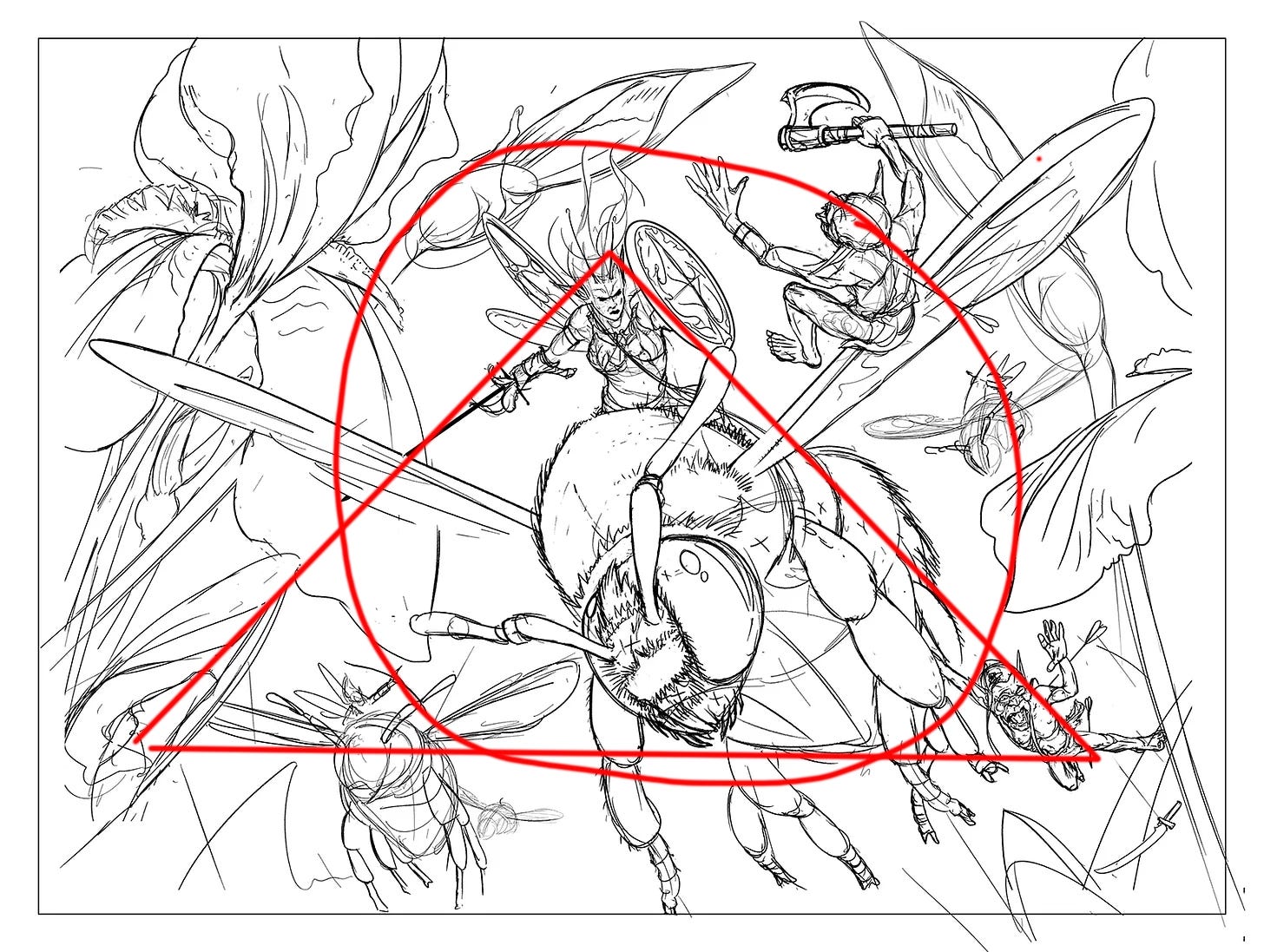
The bulk of the time on this sketch is wrestling all the parts, while keeping the focus on the main character. Most importantly the PUNCH, the impact of the Fae Warrior riding the Bee-steed needs to be front and center. She needs to fly off the page. So I opted for a classic “A” frame composition. You’ve seen them before. Frank Frazetta used them a lot. I was also conscious to keep a circle, a bullseye, around the protagonist. This aids in clarity. Let’s trap their eye in a little subliminal circle. Good good. On to inking…
2. Tools of the Trade
On the left for Inking
Top Left: The ink is sepia Daler-Rowney FW Acrylic Ink not black. Been using this ink for years and I love it. It’s dark enough to keep great contrast but not black. It’s warm, and gives a nice retro feel children’s book quality to the illustrations.
White Uni Posca Acrylic paint pen for highlights and corrections.
Inking Pen Holder & Nib: My go to pen is a Tachikawa Comic Pen Nib Holder with a G nib. I like this combo, as the nib is flexible and gives a wide range of lines. The holder is comfortable for long inking sessions, and with the right pressure, the nib is very expressive.
No. 1 Pigma marker for the clean outline around the image
Brown watercolor pencil for some accents/creases on the Irises.
On the Right for Painting
Top: Various synthetic sable watercolor brushes, one liner brush for corrections with white gouache.
Bottom: Watercolor brush pen with plain water. Schmecke watercolor set.
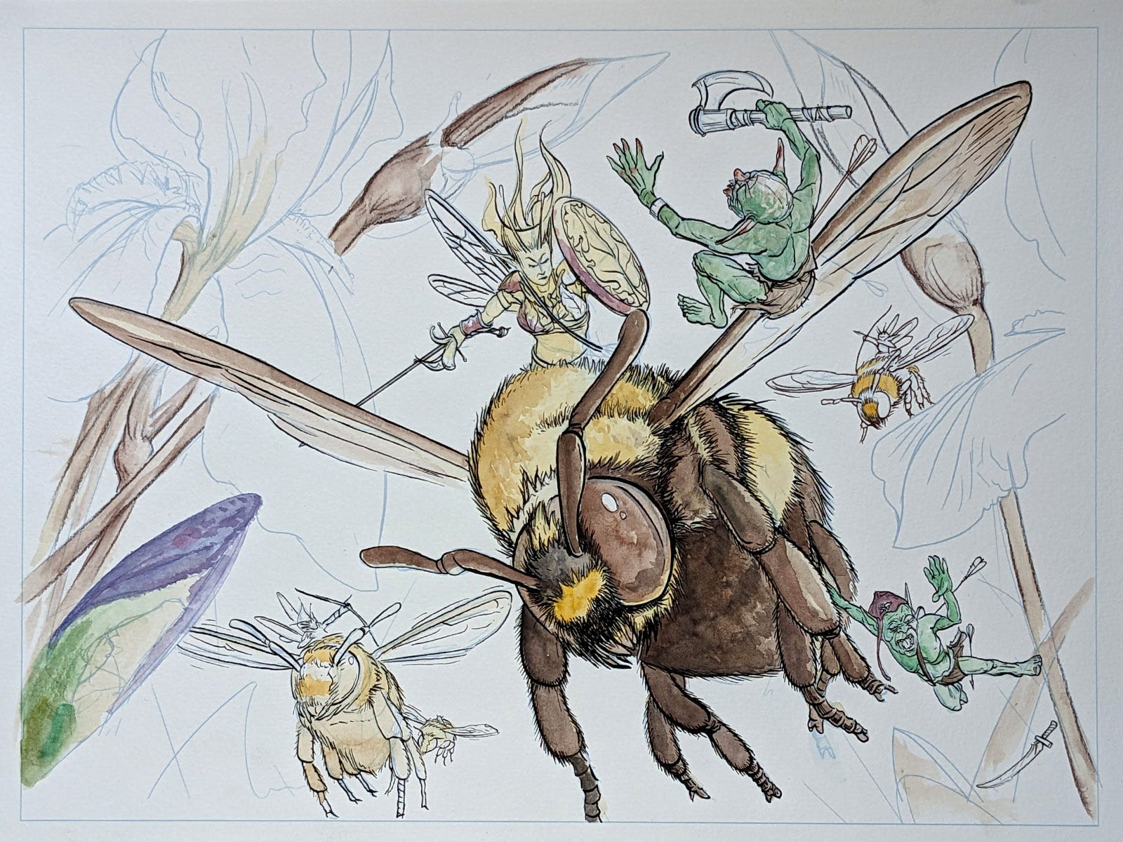
3: Transfer & Inking

Transfer: To get the finished sketch onto watercolor paper I use a Canon Pro 100 printer. The sketch is lightly printed at 15% cyan onto Canson watercolor paper from a watercolor block. The Canon Pro 100 is strong enough to handle heavy papers which was one, if not the main factors when buying it. Whatever ink I have most of other than black is used. Or an appropriate color that will melt into the piece as the watercolor goes on.
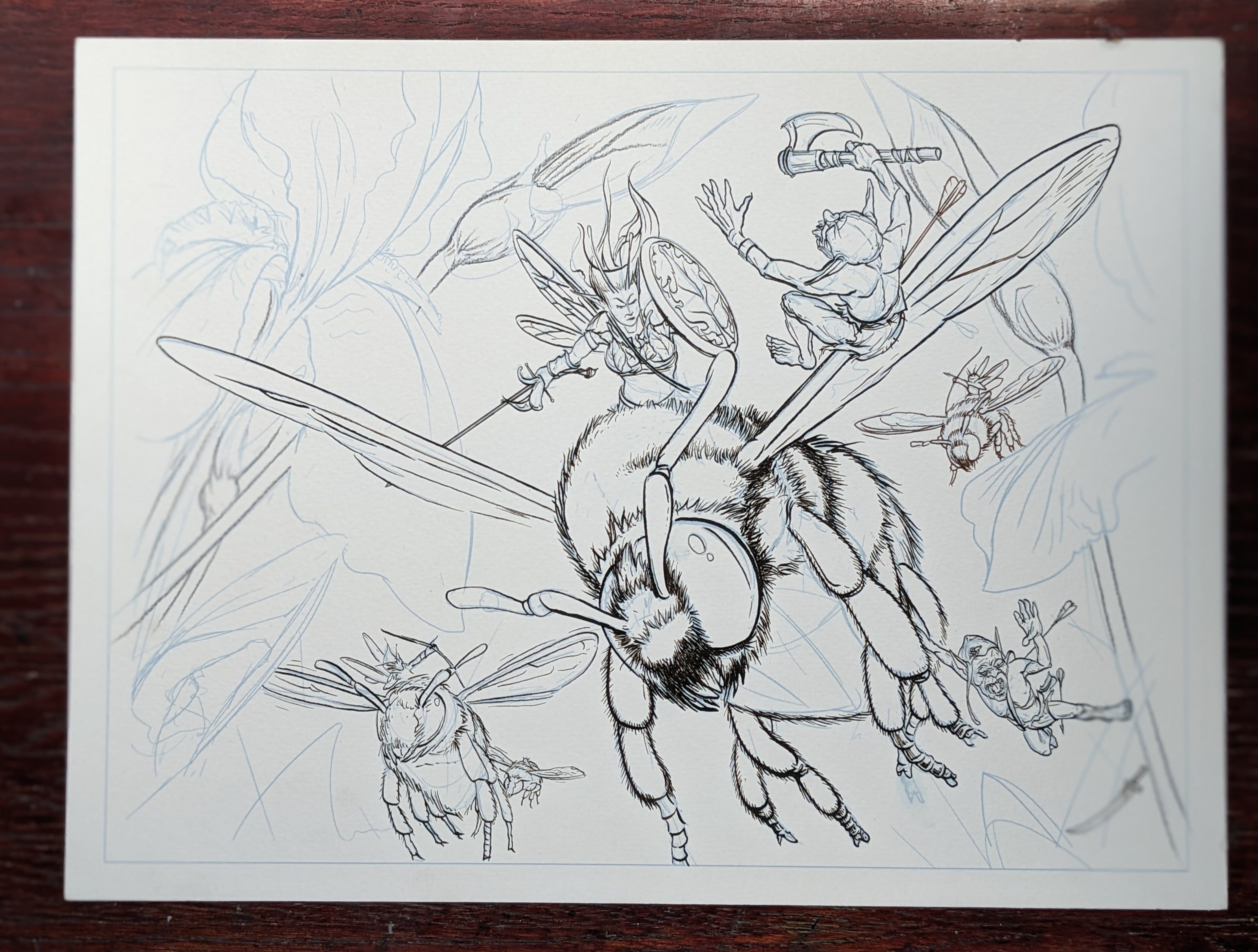
Inking: As you can see above, the printer lines will get covered by the thin and thick lines of the acrylic ink. I visually pulled the main character and bee mount forward by using the heaviest, and darkest, lines on them.
As the ink goes down, I also keep an imagined light source in the scene. The lines opposite this source are a little thicker as well, to imply shadow and light direction. I left the large irises ink free. Outlining them would have worked against their delicate feel. Watercolor will handle them just fine.
4: Base Watercolors
Base Colors: Got a little ahead of myself and had a false start! In this step I usually drop simple base colors on each element. This gives me a general idea of how things are looking and sets the sage for the bulk of the painting. Got a bit ahead of myself here, but it works out in the end. My idea to push the main figure forward needs a soft focus background with a sharp protagonist. I switched gears and decided to tackle the background before I get too deep in the main subject. This is good practice. If the background doesn’t quite gel, you haven't lost too much work.
5: Masking & Background Airbrush
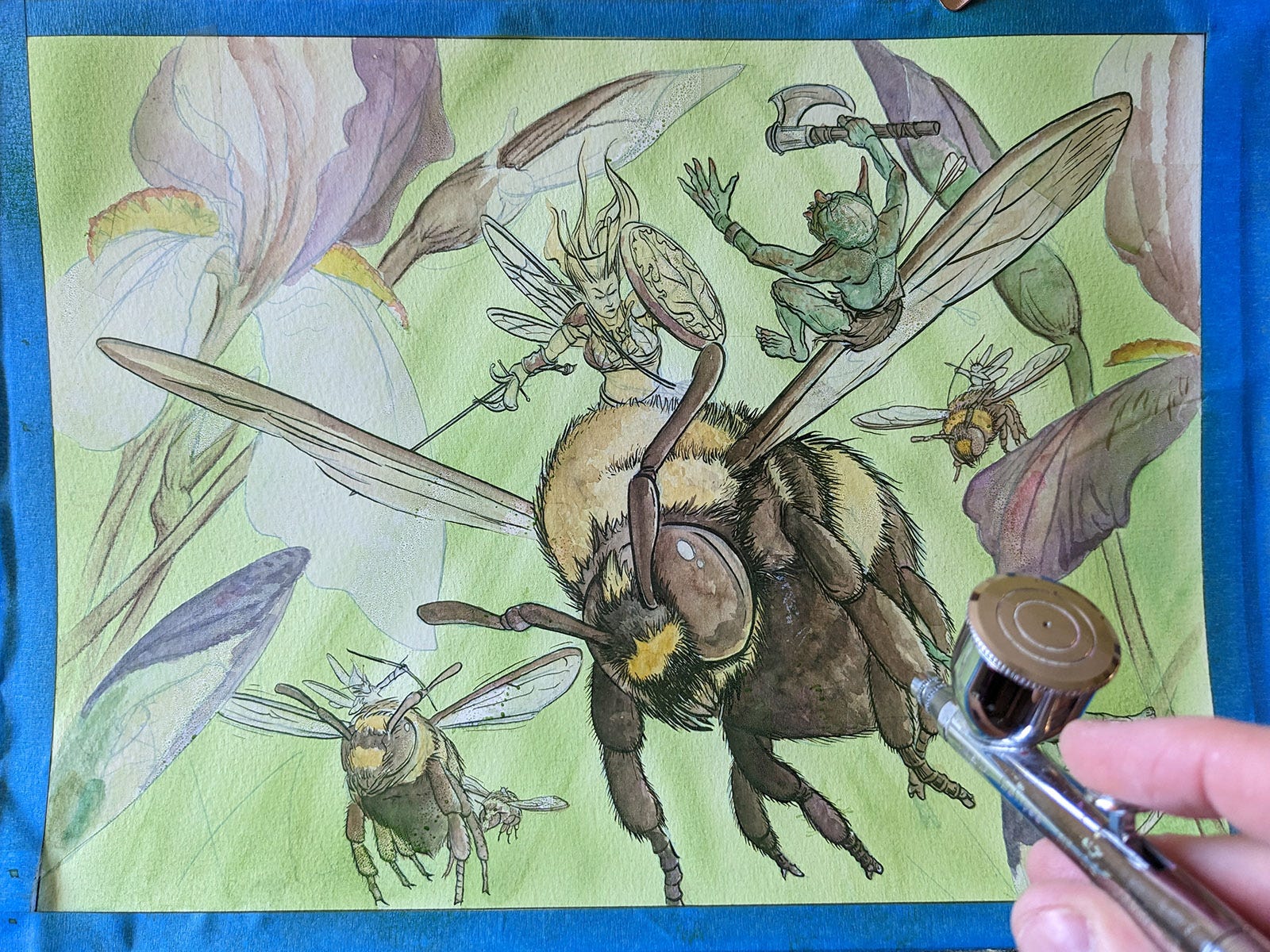
From experience a soft, out of focus background is what is needed on this one. I knew it would help pop the main character forward. So I stopped after the first pass of base colors, and masked all the subject elements. Figures and flowers got covered in low tack frisket film. Here is a short video of how this looks. It entails laying an entire sheet of film over everything, and cutting out the spaces between each figure. This is done slowly with an x-acto knife, and is quite tedious. In the end was worth it. Painters tape is applied around the edges as well.
I mixed up a small cup of grass green and lightly sprayed it on with my Iwata Airbrush above. As you can see below, the film protects the figures and allows the airbrush to spray just in the background. It was also a good time to brush in huge blades of grass. With the film protecting the subjects you can go nuts with the paint.
6: Painting, Painting, & more painting
Layers: The frisket film is removed and now the serious painting gets going. This next phase is all about layering. Go slowly to build up the level of color until the piece feels right. This is where the bulk of our time is spent. I work largest to smallest brushes always, and largest similar sections to smallest. This will get you more done the fastest. Resist the siren song of small brushes. A good rule of thumb is always use the largest brush you can for each passage you are working on. Keep in mind fewer, bigger, and simpler strokes pack more punch than a lot of small noodling strokes. Large bold moves evoke more interest as well.
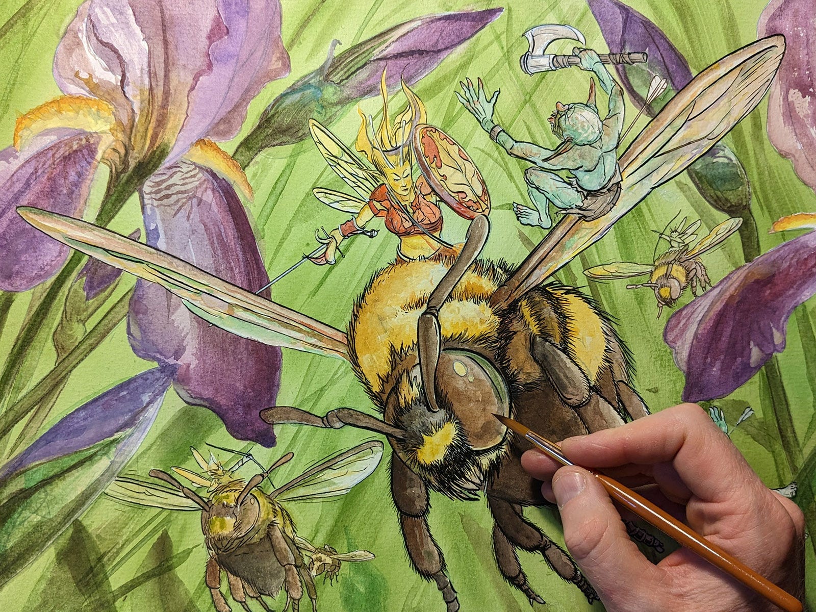
Palette: This is the third piece I’ve done with the Schmincke Watercolor Set. The colors are so intense! The color scheme here of yellow vs violet stuck in my head from the get go. I knew that those two colors are key and would sit well on a soft background of soft greens. Further, the brown/black of the bees would be a nice dark foil playing off the brilliant colors. As I painted, it dawned on me to make the main character’s armor a spot of orange/red to complete the palette. This representation of every color works, as your mind sees a bit of each and feels the piece is complete.
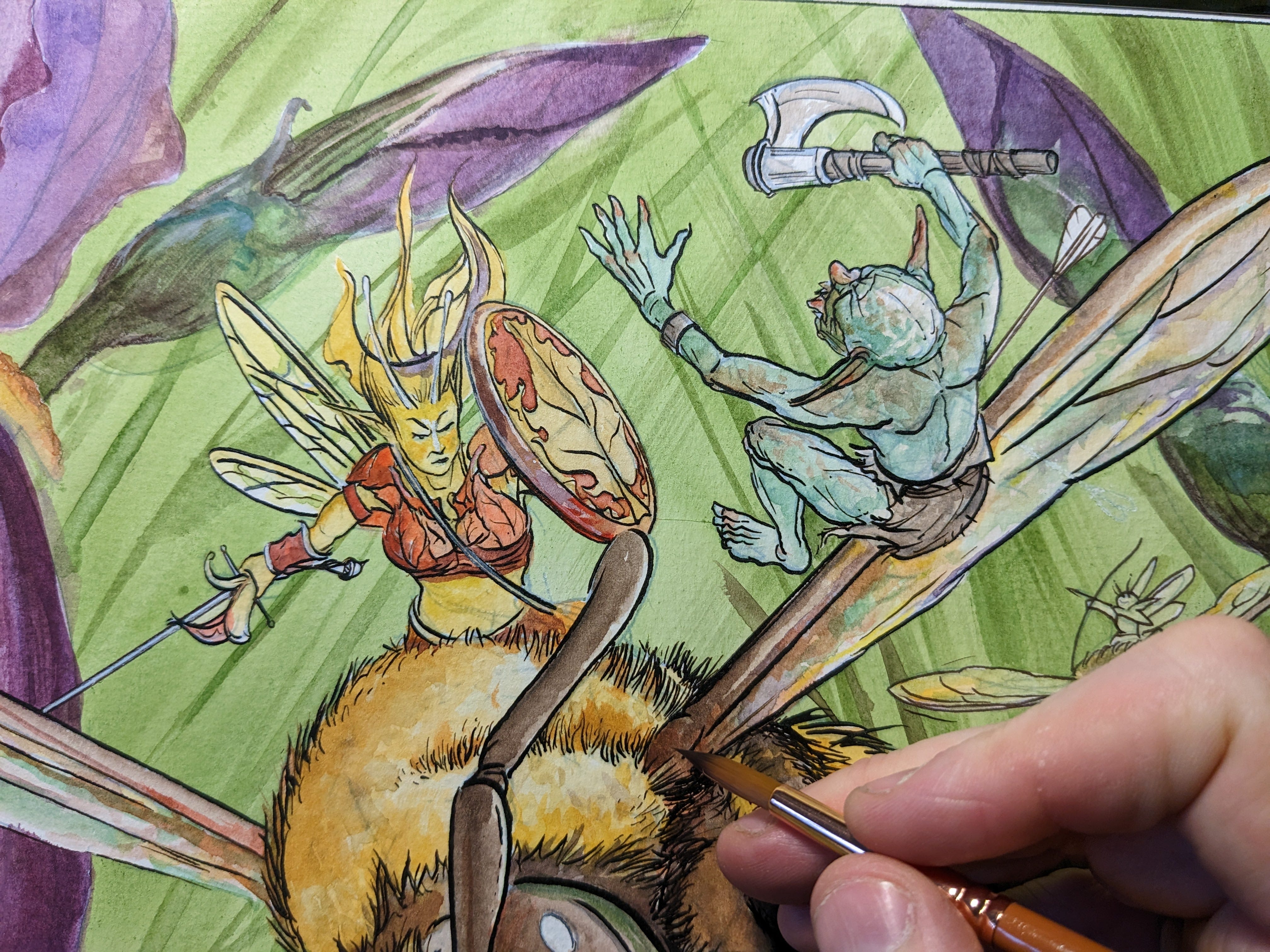
Texture: For textures I like to use a dry brush with little water, and stipple over the base colors. You can see this in the back of the top right fae/goblin falling backwards.
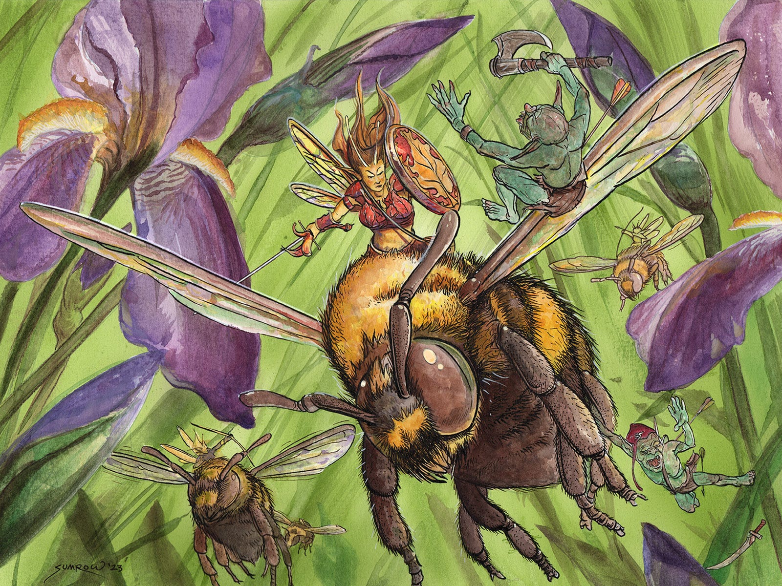
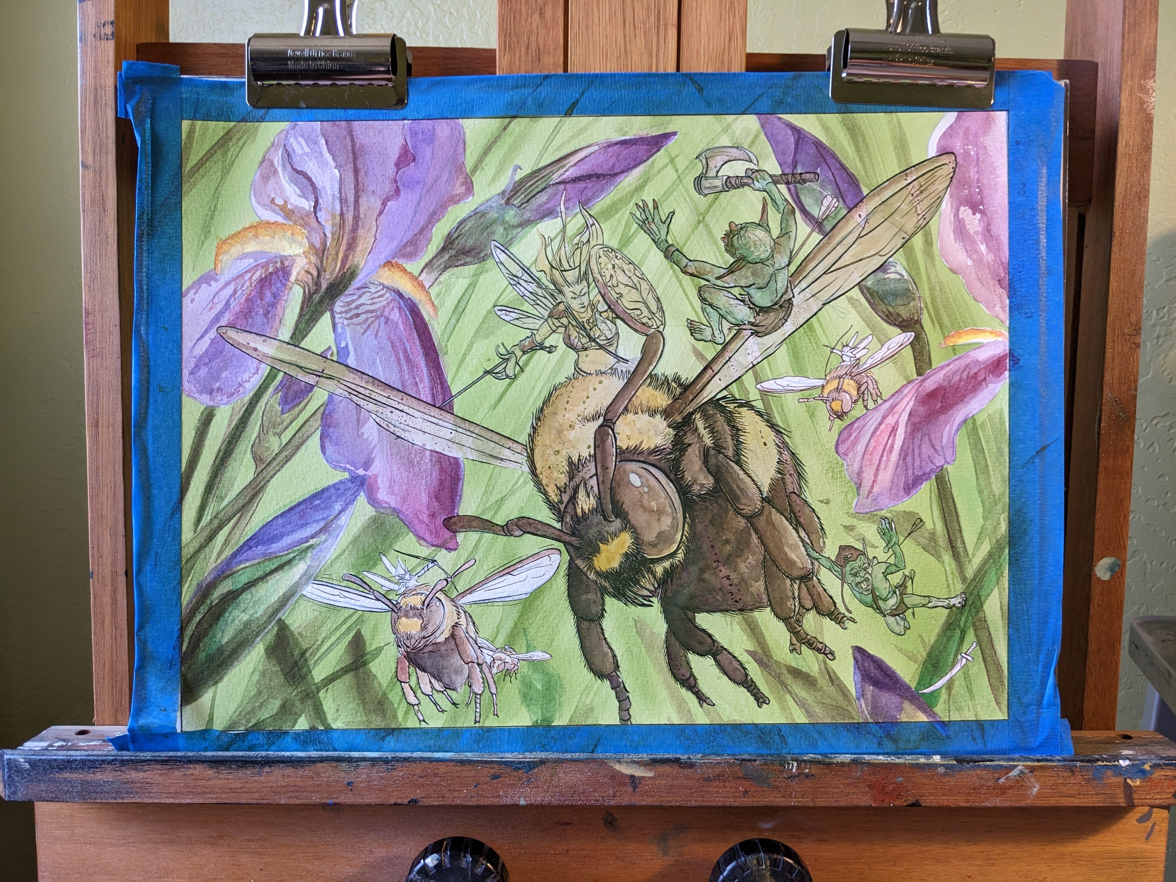
7: Finished
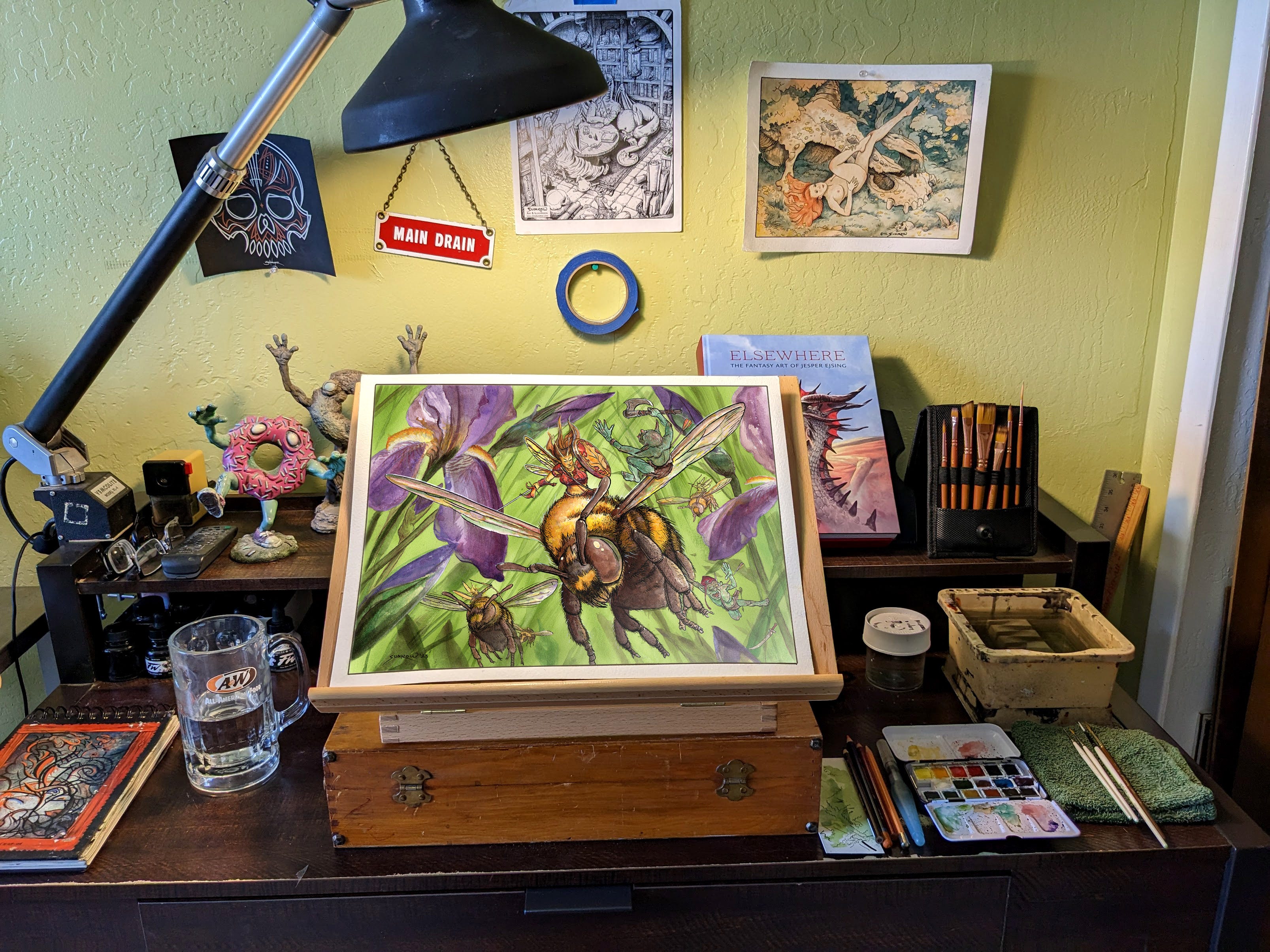
Here is the final piece with the protective tape edge removed. Recently I have switched to a more dedicated watercolor tape. This keeps the edges clean, sharp, and professional. The heavy key line around the image is done with a No.1 Sakura Pigma micron. It gives the finished art a look clean and professional. We now take it the scanner and get busy prepping files for printing.
Finished: My gut feeling on the color scheme worked. The masking, while tedious, completely payed off and was a good save. It allowed me to go soft, bold and free with the background. That, in turn, pops the Fae Warrior forward and made the effect I was after. Super pleased with that. There is a distinct three planes of the image: foreground warrior,Irises, and soft background. This is easily one of the most, if not the most complex watercolor I've done. *wipes sweat forehead*
8: Printing, Signing,& Shipping
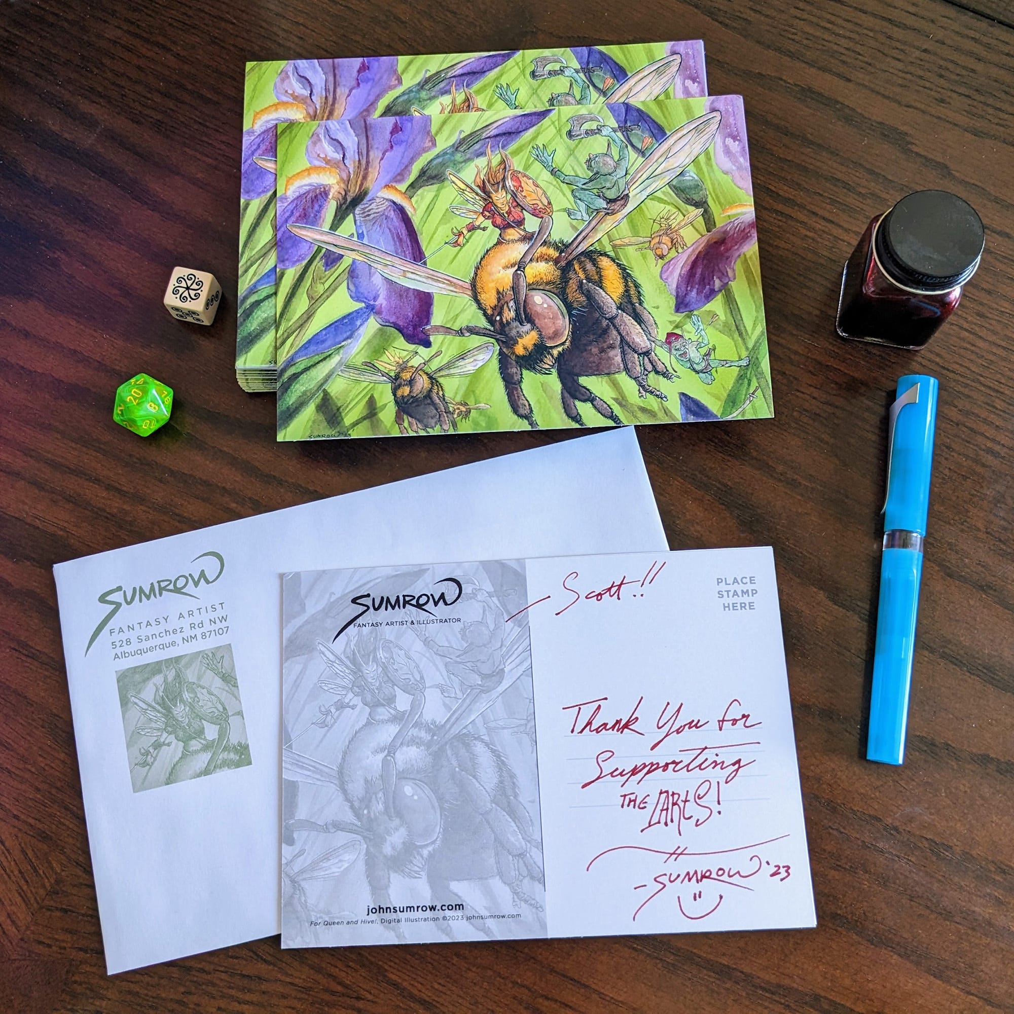
The next phase is nice and relaxing. A scan of the final art is done, and the files are set in Adobe InDesign. The files are sent to VistaPrint.com and a hundred are ordered. The cards arrive a few weeks later and I get to signing! They are then shipped around the globe! Been rocking a Twisbi Swipe fountain pen lately, and some Monteverde Cherry Danish ink. Good times.
Support the Artist Journey
Change how you feel about going to the mailbox
Suggest painting ideas –> vote –> receive Art in the Mail Monthly
For the cost of a fancy coffee, you can become a Patron of the Arts

Over Five Years of Epic Fantasy Art, 6000+ Art Postcards shipped worldwide
This Art happened because of great support from people like you! Membership gets you a voice, a vote, and an Art Postcard each month! Everyone wins. <3