Art Process: The Dragon Knot
The Process of an Art Commission in Pen & Ink + Watercolor
So I was asked by one of my good Patreons to do a watercolor commission.
This always starts as a conversation, wherein they pitch an idea. Sometimes they are not exactly sure what, but they are craving something… I’ll paraphrase:
“Craving some art. Whatever you want. Dragons are always a favorite! Or zombies?” - J.W.
“How about a Ying/Yang pair of dragons fighting? Earth and wind? Or Water and Fire? Or maybe 3 dragons? Celtic knot!?” - Sumrow
”Yes! Do THAT!” - J.W.
”Bingo!” - Sumrow
So we get to work, this is my watercolor + Ink process ninety nine percent of the time.
Step 1: Reference
First the piece starts by getting a bit of reference and inspiration materials together. There needs to be a road map to follow because I have never assembled something like this before. A simple Celtic knot was found that looked like it would fit the bill. Here “simple” is the optimal word. Going in, I know there will be lots of wings, teeth, and tails.
Step 2: Digital Sketch
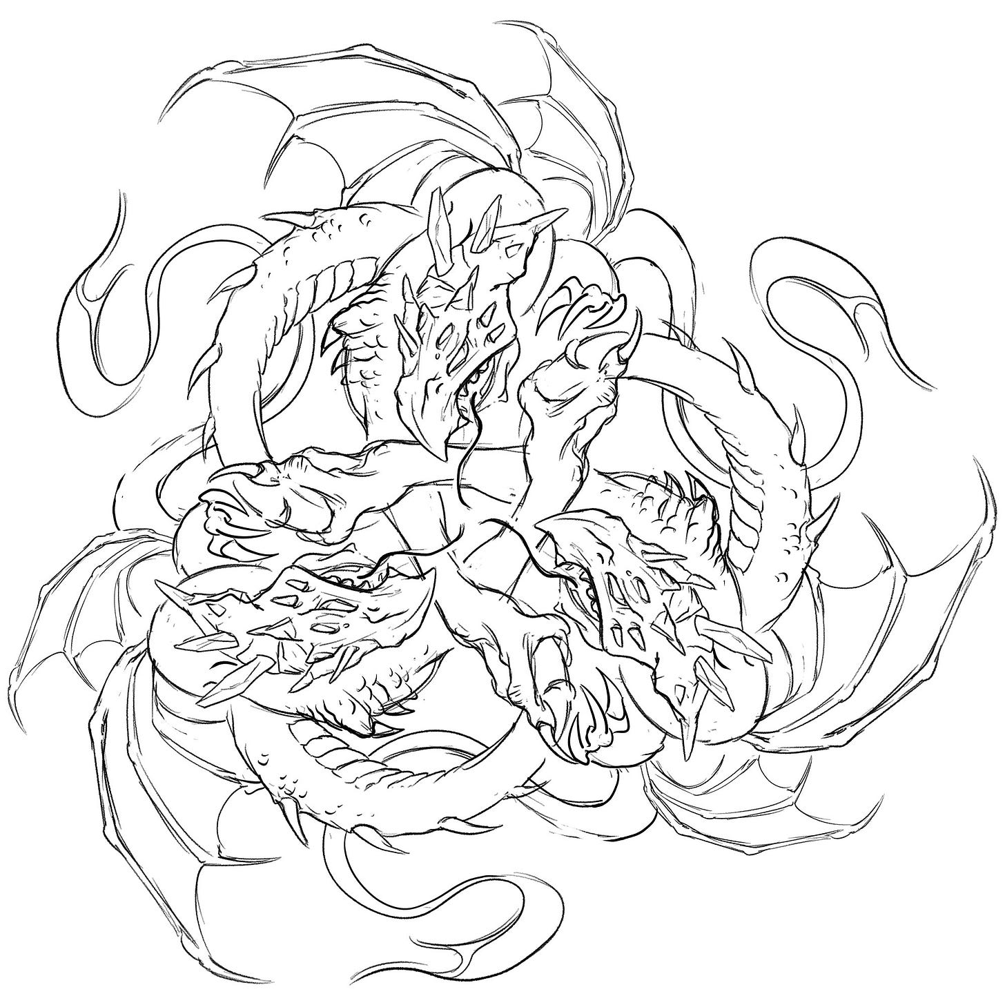
And here we are. I knew things would get busy. This one really melted my brain meats but here we are. The big thing is to get the layout nailed down. It needs to be a single sketch that the patron/client can see and understand clearly. These days I am using my trusty iPad with Clip Studio Paint 99% of the time. Paper is fine, but this one needed layers and flexibility to move, cut, scale… etc. Digital was made for this.
The bulk of the time on this sketch was trying to wrestle with all the parts while keeping the look constrained to a cohesive unit.
My inner dialog be like: “Make arm longer. No, Shorter! Adjust them teeth …too much… too much tongue, less tongue… no more tongue! Damn! Another wing! All Arms shorter! Adjust…adjust…adjust. Doesn’t fit. Shit. Shit. Forgot second set of wings! Adjust. Fits? Forgot tails! PULL UP!! YOU’RE LOOSING HERE! MAYDAY! RED LEADER! FLAMES!”
*cough* Done! Approved. Yay! Looks good. Let’s ink.
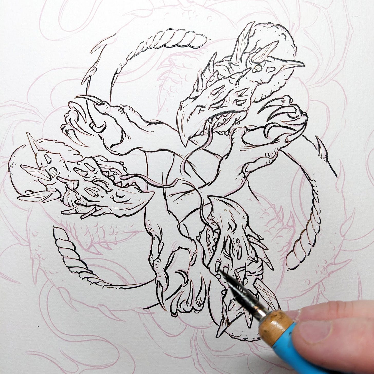
Step 2: Transfer & Inking
Transfer: To get the finished sketch onto watercolor paper I use a Canon Pro 100 printer and Adobe InDesign. The sketch from step one gets printed lightly at 15% cyan, or magenta ink onto the watercolor paper. The Canon Pro 100 is strong enough to handle heavy papers which was one of if not the main factor when buying it. I use whatever ink I have a lot of and/or an appropriate color that will melt into the piece.
Inking Pen: As you can see above the printer ink will get covered by the thin and thick lines as I ink. My go to pen is a Comic G Model Chrome Nib in a Tachikawa Comic Pen Nib Holder. I like this combo, as the nib is flexible and gives a wide range of lines. The holder is comfortable for long stretches, and with the right pressure, the nib is very expressive. I tend to imagine a light source in every piece I work on. As I ink, I make the lines opposite the imagined light source a little heavier to imply shadow.
The Ink: The ink is sepia Daler-Rowney FW Acrylic Ink not black. Been using this ink for years and I love it. It’s dark enough to keep great contrast but not black. It’s warm and gives a nice retro feel to the illustrations, like they are from an old children’s book. The warm brown is fantastic for laying in the overall tone washes into the piece as you will see.
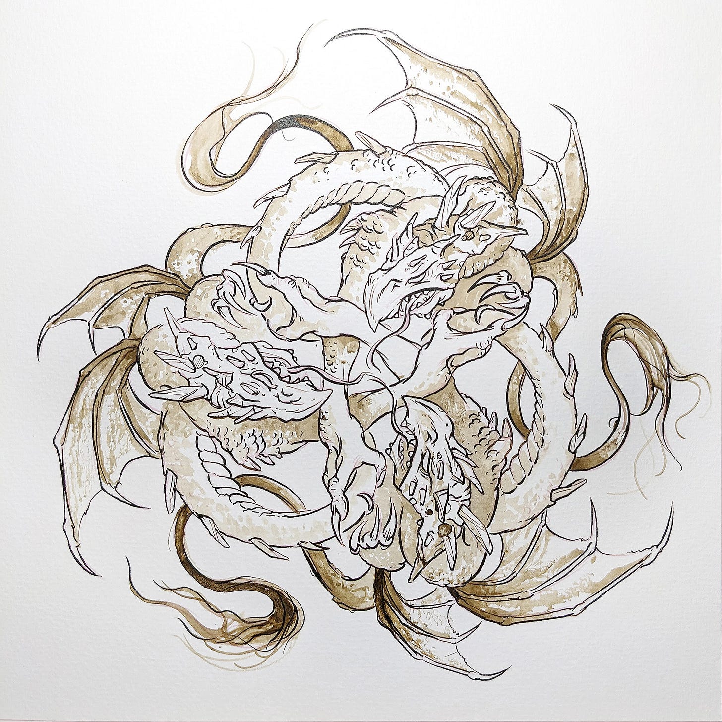
Step 3: Tones via Sepia Ink wash
Tones: This is almost like a half step from pure Ink line to watercolor. This step is where the tones are established for the piece, keeping an eye on readability. Sometimes these are so beautiful I don’t want to color them. As you can see the initial ink from the printer is mostly covered up and has been assimilated into the washes. Any remaining printer ink will be absorbed by the watercolors.
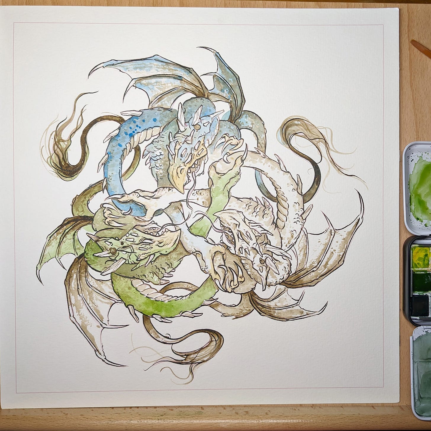
Step 4: Watercolor / base colors
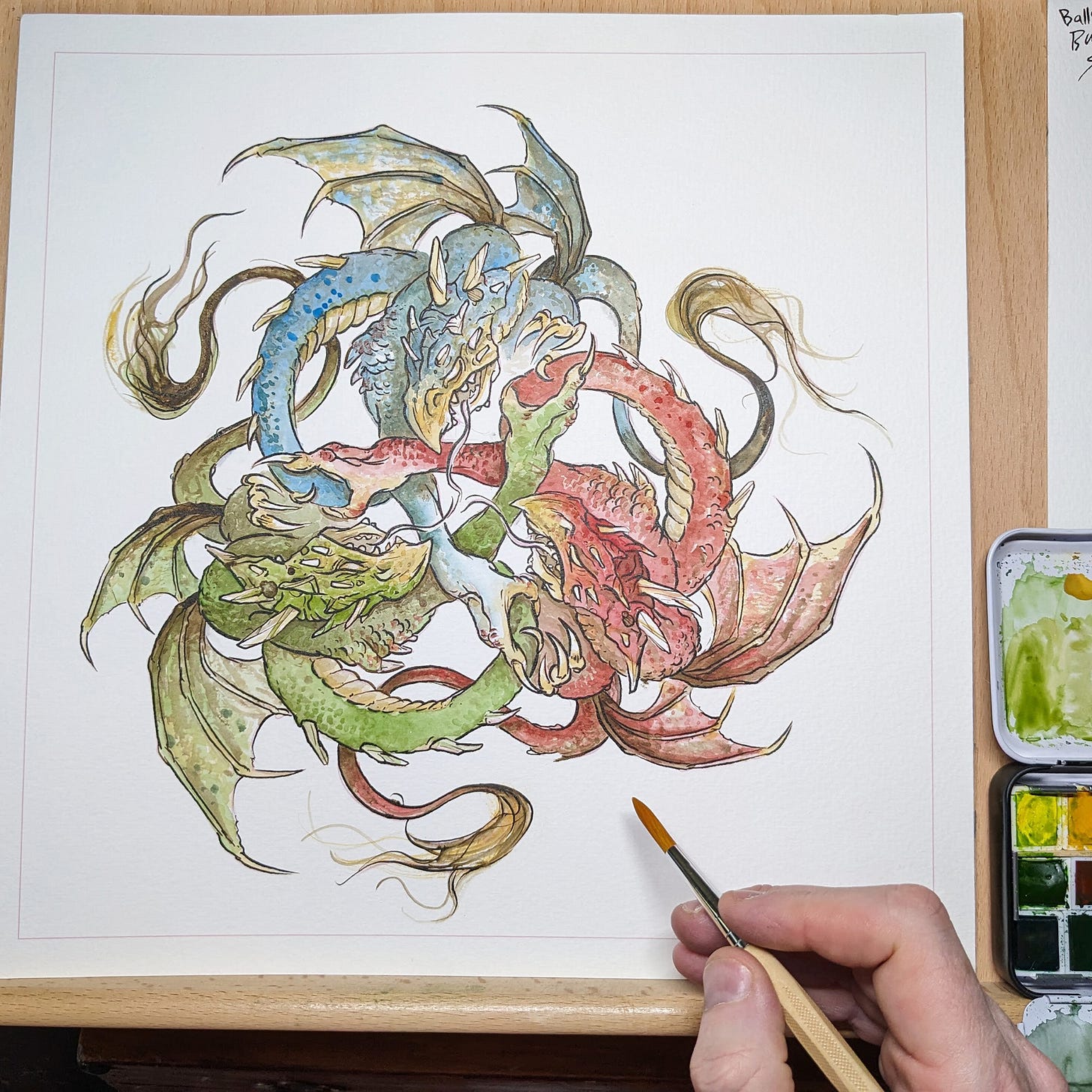
Base Colors: In this step I drop in an overall color for each element in the piece. This gives me a general idea of how things are looking and sets the sage for all the detail to come. It’s hard to resist going in and adding details, but I remind myself that is the foundation stage. Get this stage right and then the remaining work is not work – but fun! All those details, highlights, MUST RESIST. Foundation first!
Palette: This is the second piece I’ve done with my new Schmincke Watercolor Set. I waited for a sale and decided to take the plunge into a real pro set. I’m very happy. The colors are intense! So intense. Amateur or “Academic" sets use dyes a lot to compensate for a lack of true pigment. It takes much less paint with these to get where you want to go. I’m sold. It is a joy to work with these. Lot’s more watercolor pieces in my future. For this piece the tried and true color scheme of RGB was chosen.
Step 5: Watercolor build up & Details
The photos do not do these justice. And that goes for most original paintings. If you see them in the flesh, in a gallery, they have so much more depth.
Layers: This phase is all about layering, to slowly build up the level of color until the piece feels right. The tones are adjusted sometimes as I go, by reverting back to the acrylic ink Sepia washes.
Texture: For textures I like to use a dry brush or stipple technique over the base colors. Alternatively, If you look at the wings, you can see where I raked a fairly dry brush on its side, to grab the paper texture and cause a scumble. This breaks up the color of the stroke and makes a wonderful “dragon wing/skin” texture. This is what watercolor paper is made for. Exploiting the papers natural texture to make implied dragon scales and skin.
Highlights: The last thing to go down is a few lost highlights. I use Daler-Rowney FW Acrylic White Ink this time in the dip pen, to add back in a few catch highlights in the dragons eye, and a few scales. This white acrylic ink is also great to fix a few spots where my pen & ink lines went astray.
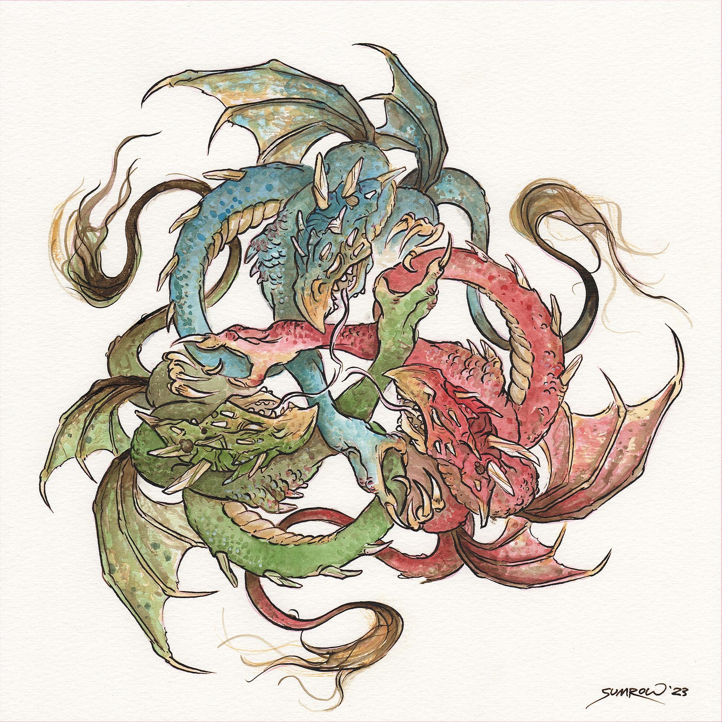
Step 6: Finished

Finished: Done! Very pleased with this piece. I’ve done several Ink & Watercolor over the years but this “design” style is all together new. It was a great experiment and I am very happy with the results. Usually I do a narrative fantasy scene with action, combat, adventure! This was a welcome change of pace.
A thank you for Reading
As a thank you for receiving this newsletter, here is a 10% off Coupon Code.
Use Code: CREATIVE10 (Good for the rest of 2023)
Support the Art Quest
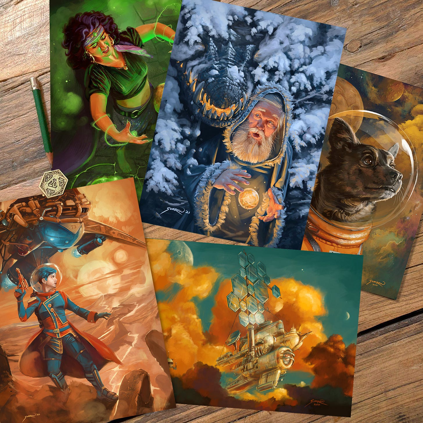
Change how you feel about going to the mailbox! Get magical, colorful Art delivered to your door. Over 5,000 Sumrow Art postcards shipped world wide!
Over Four Years of Epic Fantasy Art, 5000+ Art Postcards shipped worldwide
This Art happened because of great support from people like you! For the cost of a fancy coffee you get a piece of art that costs hundreds of dollars right to you. Everyone wins.
• Over 5000+ Fantasy Art postcards shipped worldwide
• Over 60 original works of Art made from your suggestions
• Bonus Handmade, limited edition, Silkscreened Greeting Cards when the stars align
Monsters, heroes, dragons, and humor – your support allows me to focus on creating original projects. Your coins will help me fund original quests, acquire supplies, and most importantly free up time to focus on original Art.
The Quest continues…


